Oria
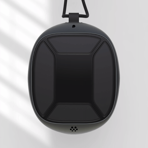
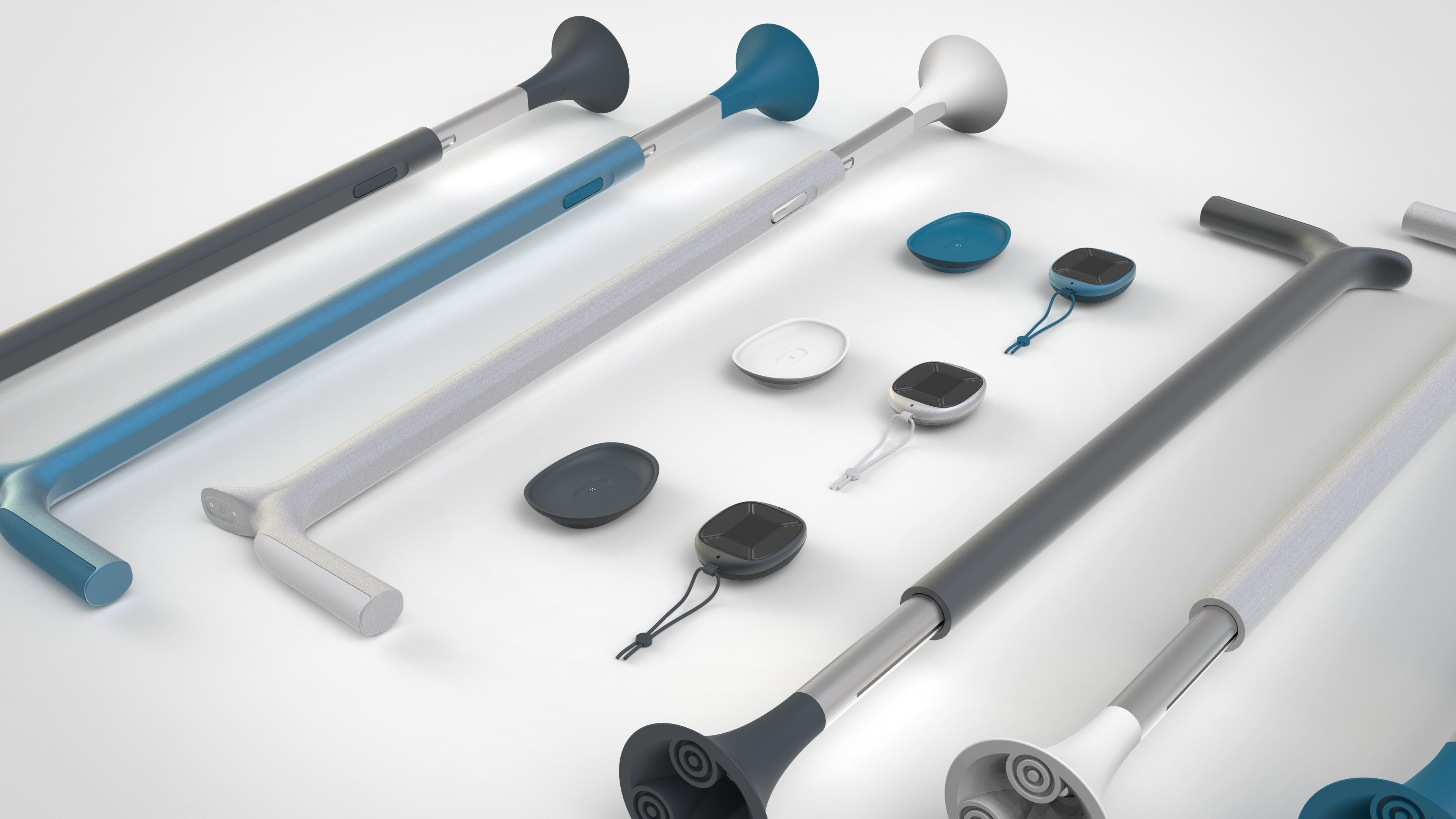
Our inclusive design project focuses on empowering individuals with Parkinson's disease. Recognizing the potential of smart home/phone technology for independence, we developed an intuitive solution tailored to older demographics. By integrating rhythmic vibrations (haptic therapy) into a handheld package and walking cane, we aim to improve mobility and motor skills.
Initial Research
With the help The Cure, Parkinson's Trust UK, we were able to gain an insight into the daily lives of both sufferers and carers. A series of interviews and conversation helped to define clear design requirements for our concept. The product needs to provide independence to sufferers whilst alleviating pressure from the carers.

User Interface Design
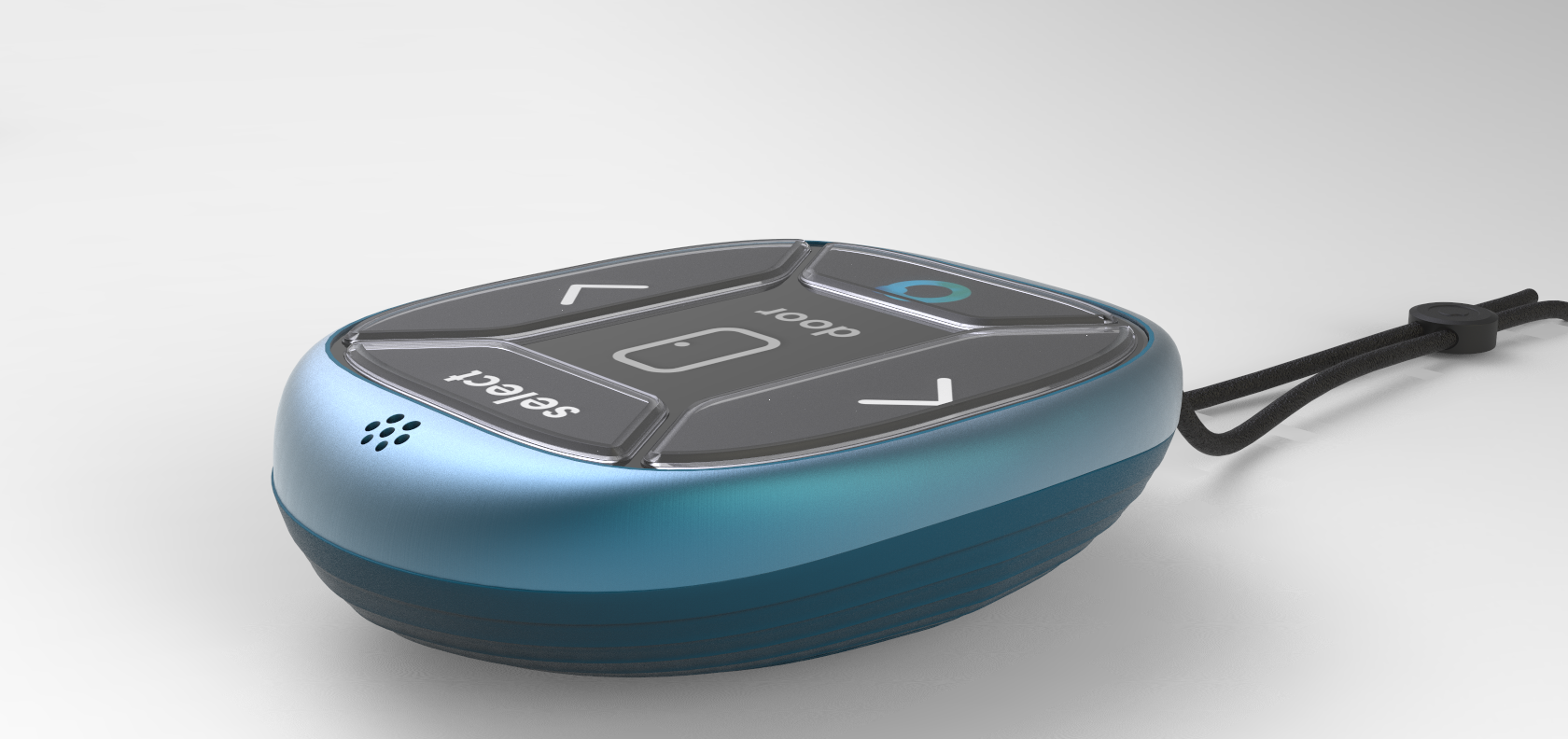
Goal: Intuitive navigation with only 4 buttons.
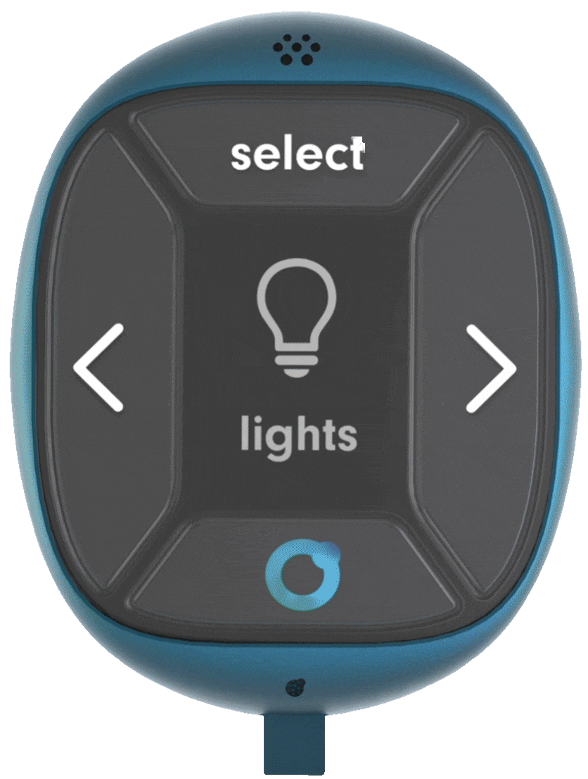
The main challenge with the UI was having a high degree of usability with just 4 buttons. Below all the main function have been mapped in the positions that the UI would be navigated:
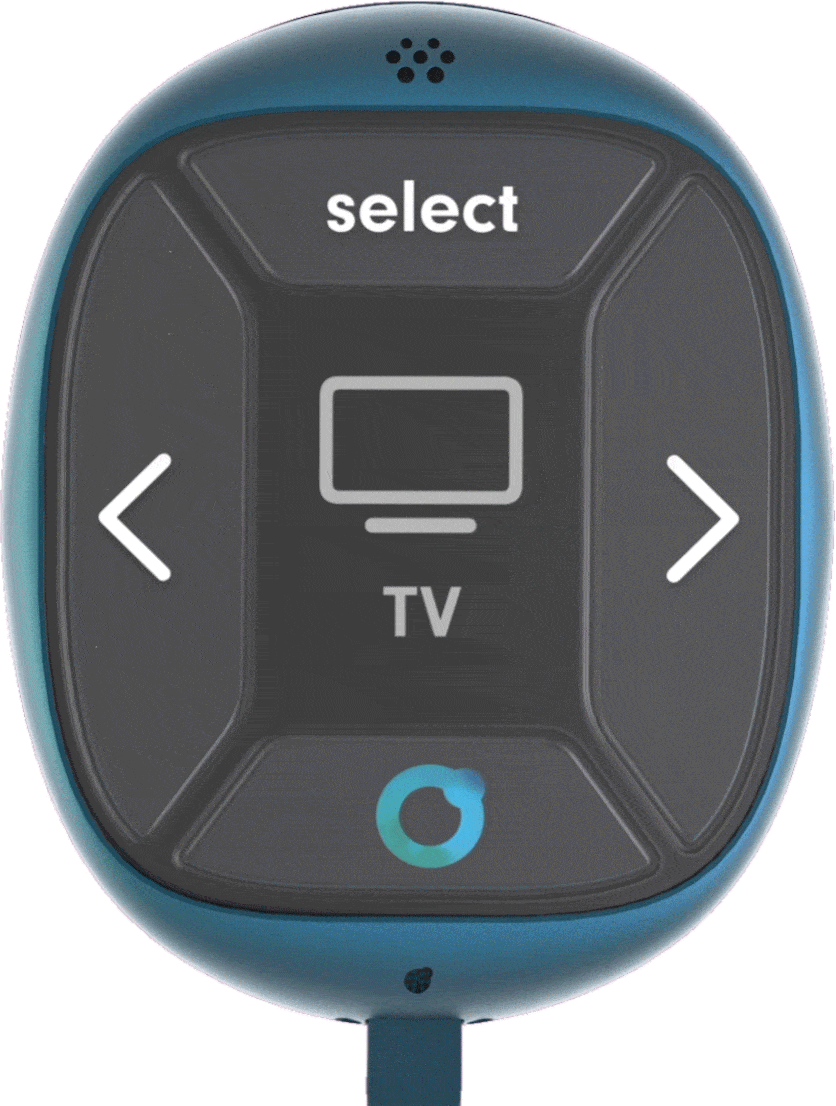

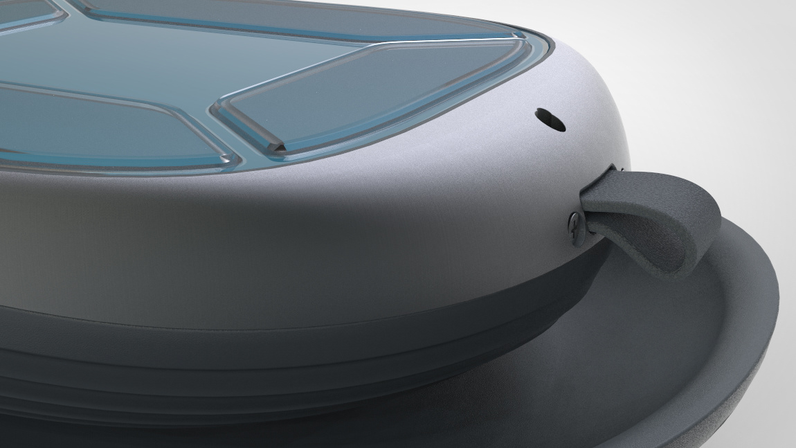
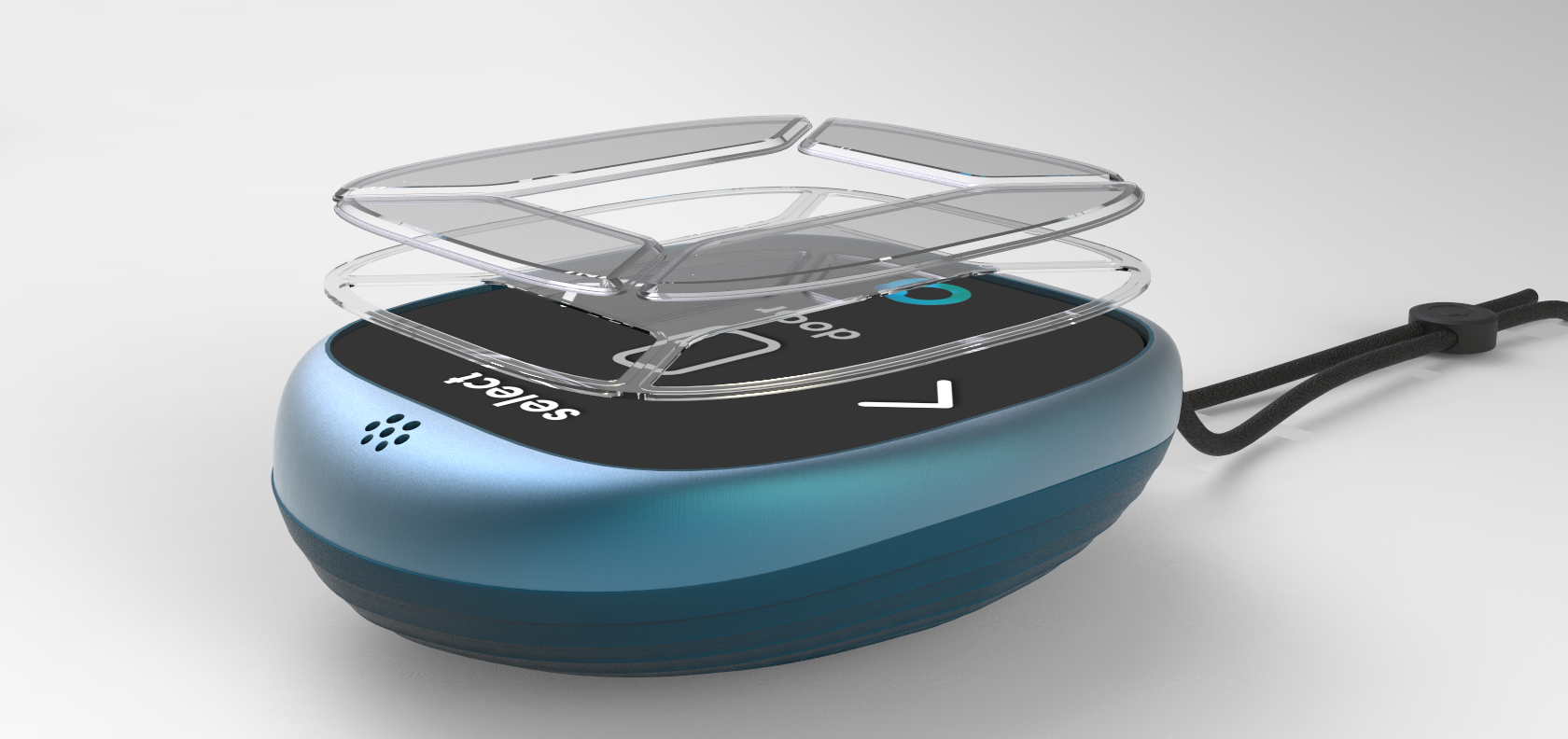
Tactile touchscreen overlay, a solution to tremors and stiffness.
From interviewing sufferers, it was clear that physical buttons were preferred to touchscreen interfaces, This is mainly due to hand stiffness and tremors affecting hand movement. However, unlike a touchscreen, the affordance and functions of physical buttons are unable to change during device navigation. Our solution to the problem was a clear TPU membrane that overlay the AMOLED touchscreen. Giving the tactile feel of the physical button whilst being able to change functions.
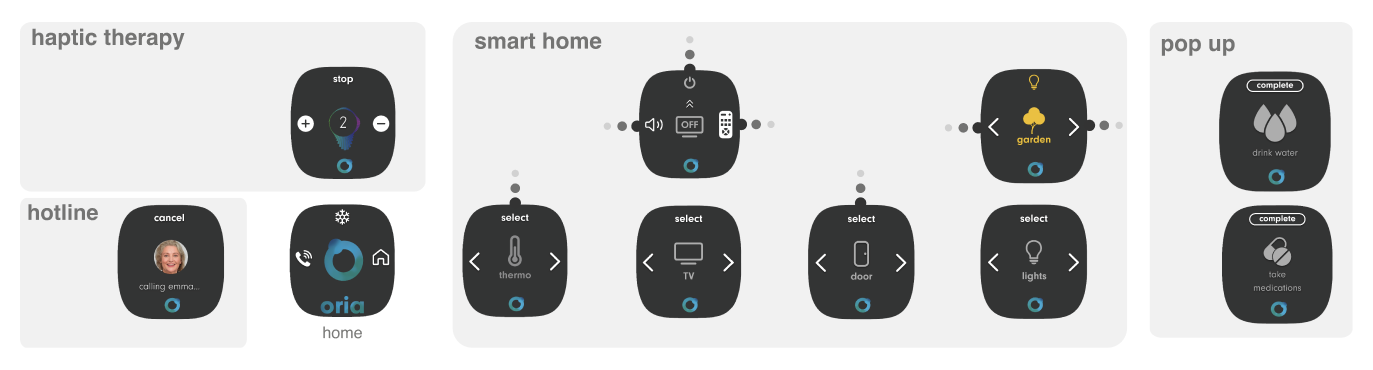
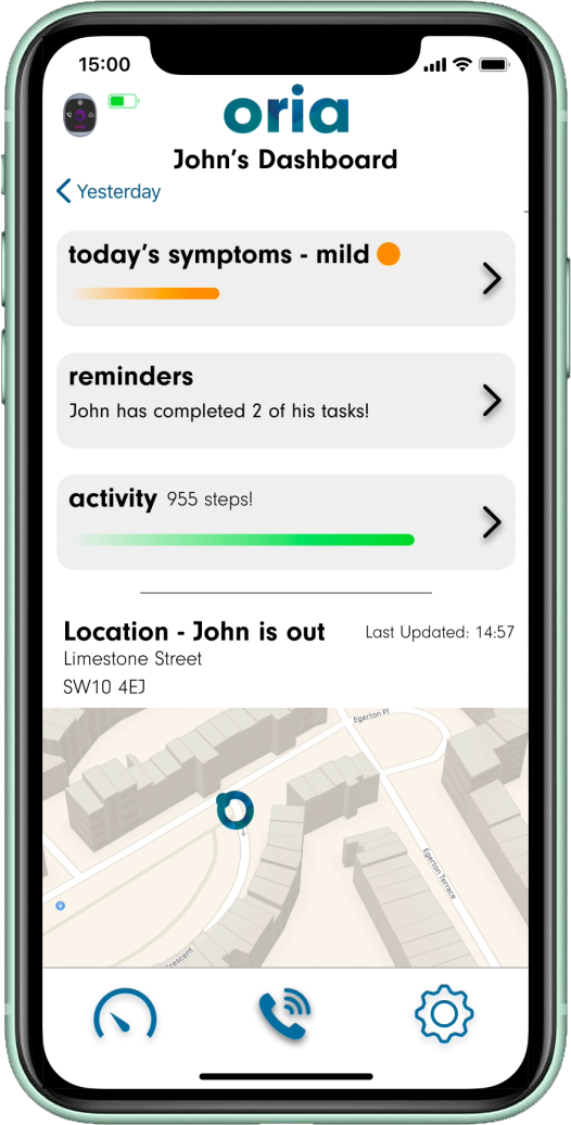
The carer is always at hand.
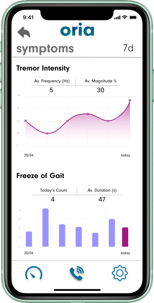
The main dashboard contains a summary of the sufferers day. The carer is very quickly able to identify the severity of symptoms as well as the level of activity. The carer is also able to quickly identify the sufferers location form the gps installed in the device. Upon selecting the symptoms tab, the carer is presented with a detailed log on tremor intensity and freeze of gait.

Banding Development
A sense of companionship.
In oder to make Oria feel like a companion, the standby interface needed to look alive, responsive and reactive. We designed a dynamic gradient whereby different hues of our colour palette move around the composition, creating a vibrant ‘swirling’ effect. Our initial colour pallet was purple however we quickly agreed this was not gender neutral - especially with the name "Oria".